Your software is fine. No bugs, no crashes; everything works exactly as planned. But users keep bailing. They complain, get frustrated, and jump ship to competitors. Here’s the thing: nothing’s actually broken. People just can’t figure out how to use it.
The Hidden Cost of Confusion
Confusion destroys products way faster than technical problems. A crash annoys someone once. Confusing design annoys them every day. Remember downloading that app last week? You gave it maybe thirty seconds before deciding if it was worth keeping. Couldn’t find the main feature? Delete. Settings buried somewhere weird? Delete. Too many steps to do something basic? Delete. That’s how everyone operates now. Nobody reads instructions anymore. They want stuff to work right away, or they’re gone.
Support teams know this pain. Their inboxes overflow with questions that shouldn’t exist. How do I log out? Where’d my file go? Why can’t I share this? These aren’t tech problems. The software works perfectly. People just can’t figure out where anything is or what anything does. Every confused customer costs money and patience.
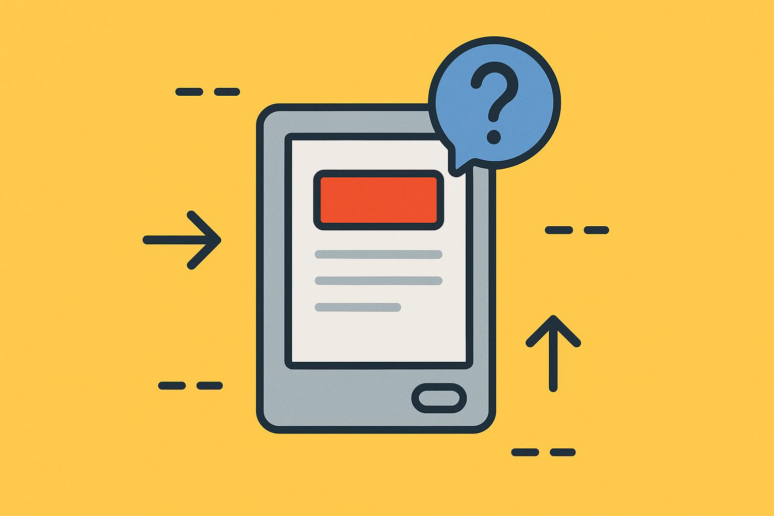
Why Smart Features Feel Stupid
Developers get high on their own supply. These impressive and highly functional features are developed but then hidden within obscure icons and multi-layered menus that are only understandable to the original developers. Here’s what happens. You work on something for months. Every button becomes second nature. The weird workflow that takes seven steps? Feels totally logical to you now. Your brain can’t unknow what it knows. So you literally cannot experience your product like a newcomer would. You’ve lost the ability to be confused by your own creation.
New users open your app and freeze. Nothing looks clickable. Random tapping becomes their strategy. They wander through screens like lost tourists, hoping to stumble upon something useful. That amazing feature you spent three months perfecting? Might as well not exist if nobody can find it.
Design That Actually Helps
Solid design stops confusion before it starts. Goji Labs gets this right. Their UX/UI work goes way beyond making things pretty. They have a knack for making complex subjects seem simple. Visual hierarchy guides your gaze to the most important elements. Patterns repeat so you learn once, not constantly. Familiar concepts connect to new features so everything makes sense faster.
Colors mean things. Red screams danger or delete. Green whispers go ahead. Arrows push you forward. Progress bars show what’s left. These visual hints work across languages, across cultures, across education levels. They guide without explaining. But plenty of products ignore these basics. They use gray text on gray backgrounds. They make important buttons tiny and decorative elements huge, and they change patterns randomly between screens so nothing feels connected.
Testing With Fresh Eyes
You can’t spot your own confusion. Neither can your team. You’re all too deep in it. Your mom won’t tell you your app sucks. Your friend feels too awkward being honest. Real testing requires strangers. Watch them try to sign up. See where they pause. Notice when their faces scrunch up. Clock how long before they quit. Don’t help. Don’t hint. Just watch the confusion unfold. It hurts, but it’s gold.
Conclusion
Products rarely break anymore. They just confuse people. The tech works great while the human experience falls apart. Fixing this means accepting an uncomfortable truth. Just because something makes sense to you means nothing to anyone else. Plain language beats fancy terms. Consistent design beats creative surprises. Watching confused strangers beats assuming you know best. Build for the bewildered person downloading your app right now, not for yourself.


